Rayuela
Identity & Editorial Design
Client
Rayuela is a children’s school based in Málaga. They briefed to create an unique identity getting away from the typical image of this kind of centre.
Concept
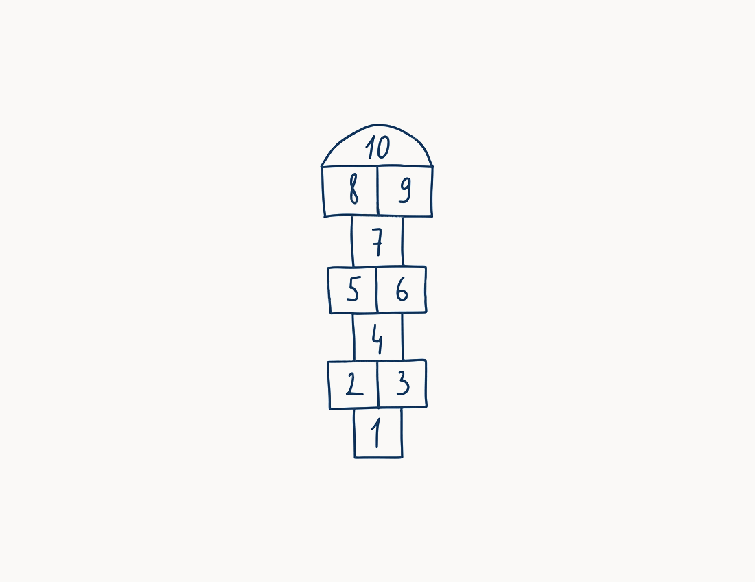
Rayuela stimulates children's vocation through play since play is the best way to learning. I developed the concept from the La Rayuela game (hopscotch in english), creating a group of emojis to create a communication strategy for the brand.
My role
Naming, concept, research, art direction, copy, creativity
and design.
The Concept
To choose the typography I took as a reference the Montessori (one of the methodologies used by the centre) toys, which are like thick blocks with different shapes.
I chose PlumeAd by Dalton Maag foundry since I found it is perfect to communicate to users the values of the centre: a modern, minimalist and enjoyable place for kids.
The founders of the centre wanted to develop a minimalist but modern place to enjoy and learn. They use the best methodologies to develop their own, and they wanted to create a modern brand which communicates a contemporary centre adapted to current times.
To achieve this I devised a main emoji based in the game of La Rayuela, and from this emoji I designed a group of them to develop a dynamic, modern, minimalist and contemporany brand.
Claim
“El mejor camino hacia el aprendizaje” (The best way/path to learn) is the main claim of the brand. With this claim I want to relate the ideas of path, Rayuela (hopscotch) and learning.
“El mejor camino hacia el aprendizaje” (The best way/path to learn) is the main claim of the brand. With this claim I want to relate the ideas of path, Rayuela (hopscotch) and learning.
The cover
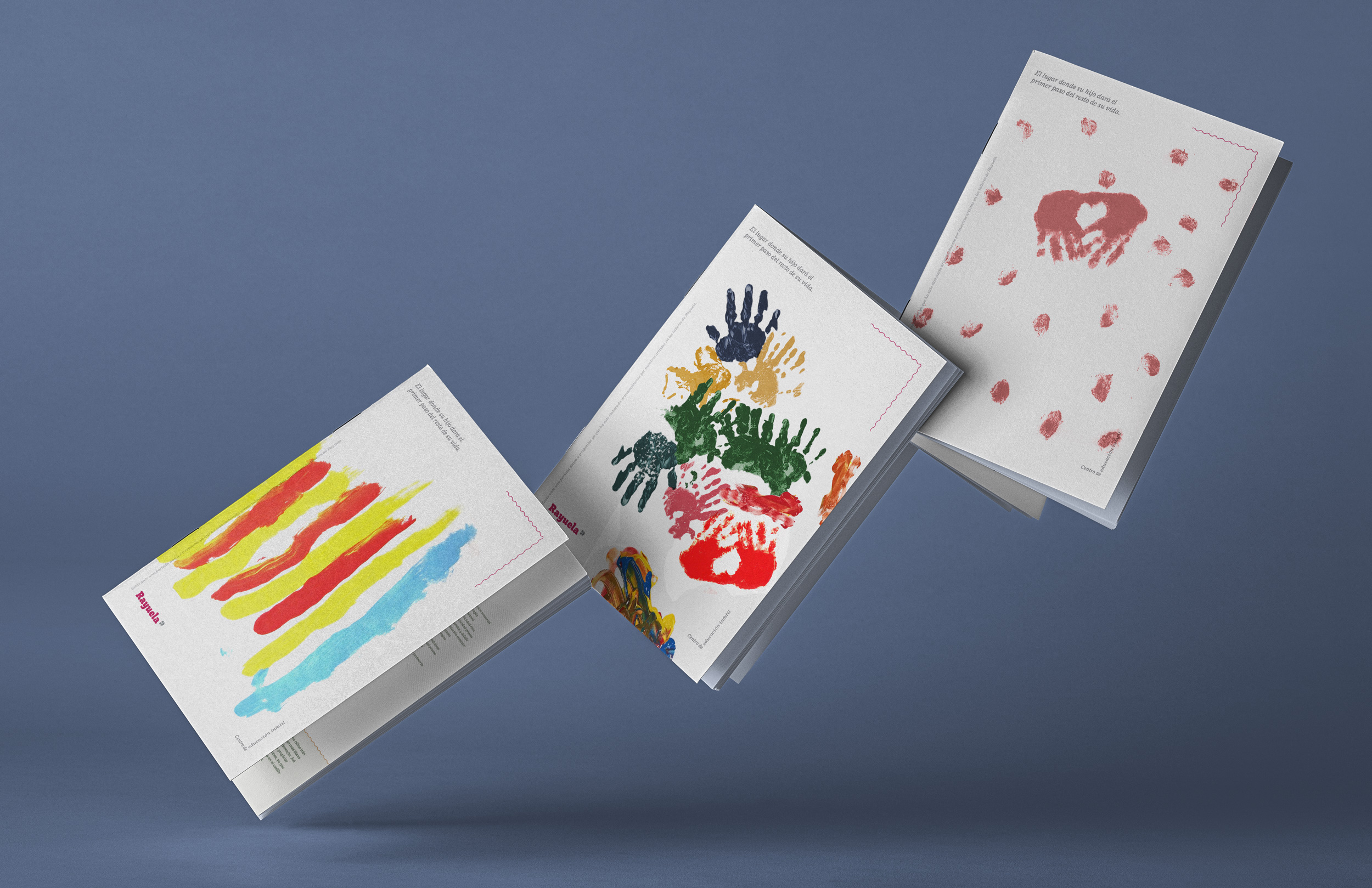
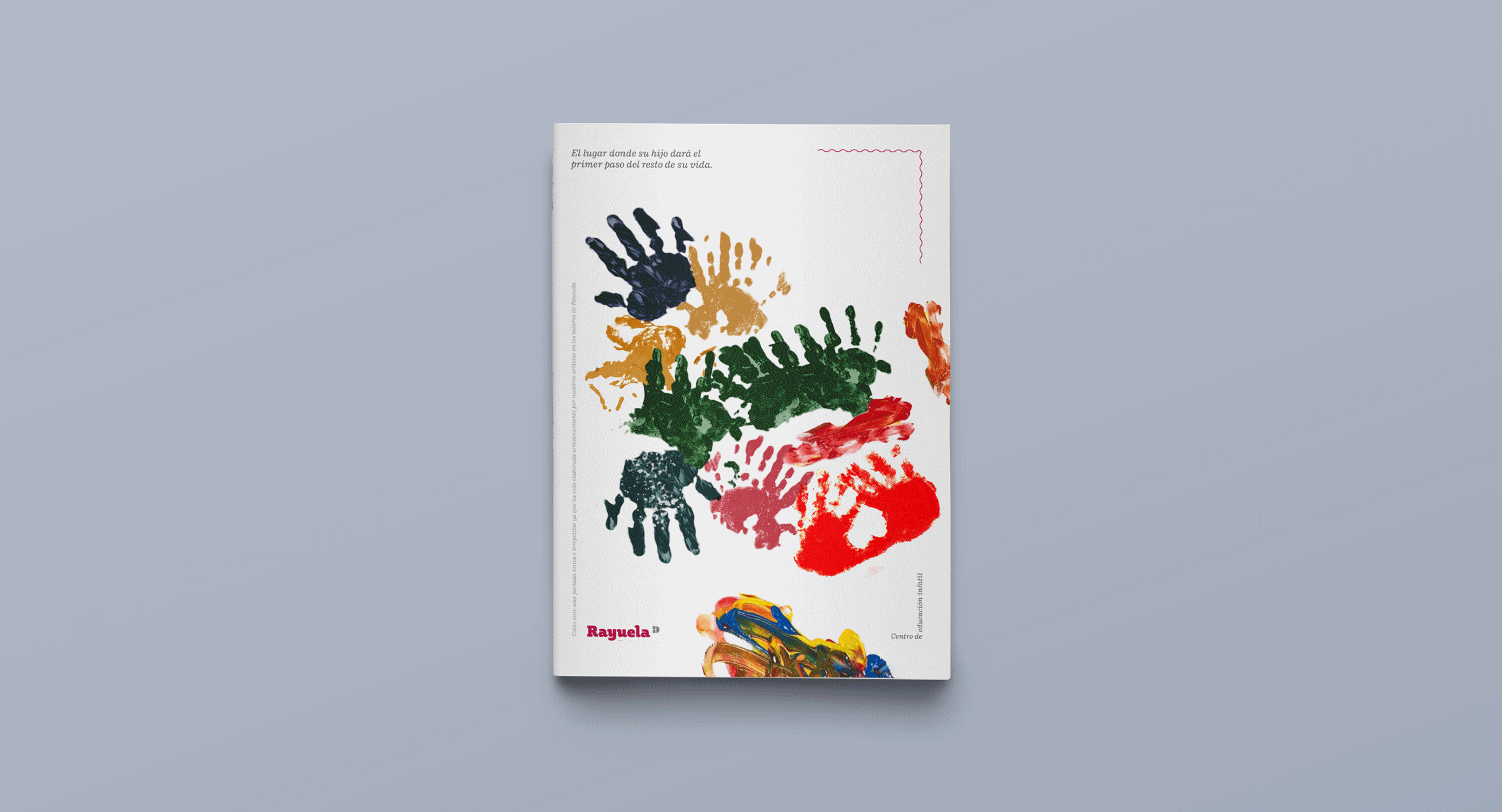
I wanted to transmit the spirit of the centre in the cover of the brochure. To achieve it we created a blank cover which is like a canvas, then, the centre will create their own covers organizing different workshops where the kids themself will be able to create the covers through artistic activities. As a result, each copy of the brochure is unique and different to others.
I wanted to transmit the spirit of the centre in the cover of the brochure. To achieve it we created a blank cover which is like a canvas, then, the centre will create their own covers organizing different workshops where the kids themself will be able to create the covers through artistic activities. As a result, each copy of the brochure is unique and different to others.
Resources
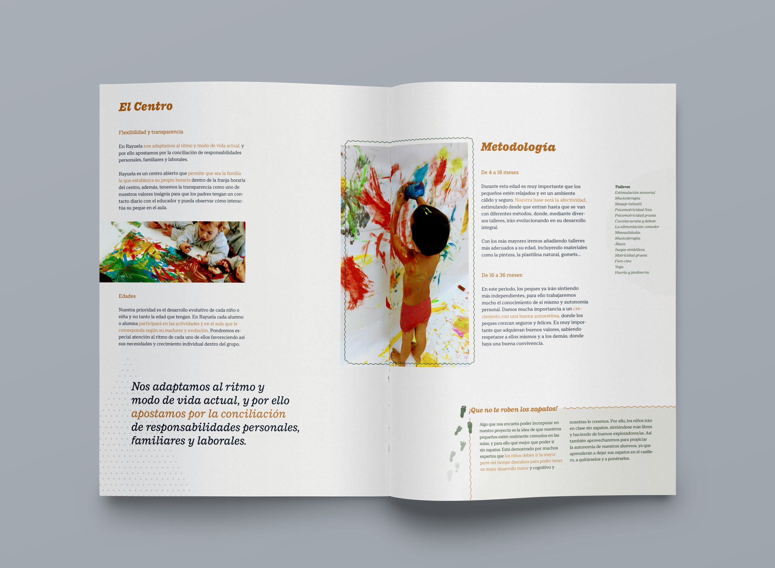
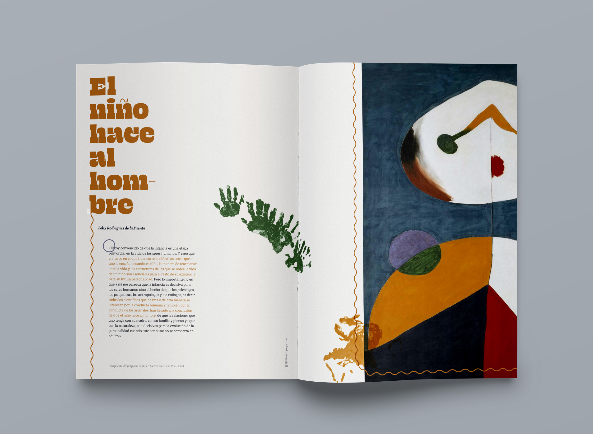
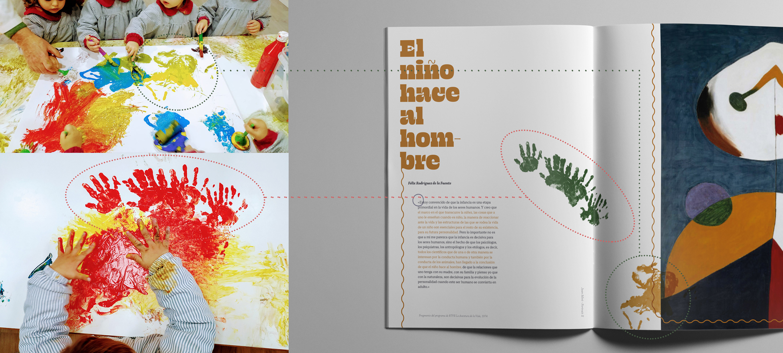
The biggest challenge I faced was the lack of resources or graphic materials we had and I didn't want to use pictures from image banks. The solution was to take the resources from the previous workshops and different activities they did at school.
The biggest challenge I faced was the lack of resources or graphic materials we had and I didn't want to use pictures from image banks. The solution was to take the resources from the previous workshops and different activities they did at school.
Content
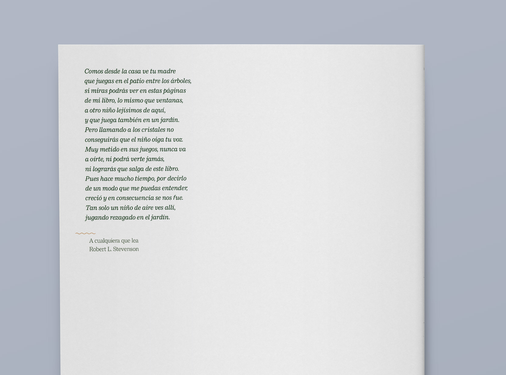
To create an original narrative and spirit to the brand, I researched to find texts about how important is to have a creative and enrichment childhood and I included them in the brochure.
To create an original narrative and spirit to the brand, I researched to find texts about how important is to have a creative and enrichment childhood and I included them in the brochure.