Therus invest
Branding & Web
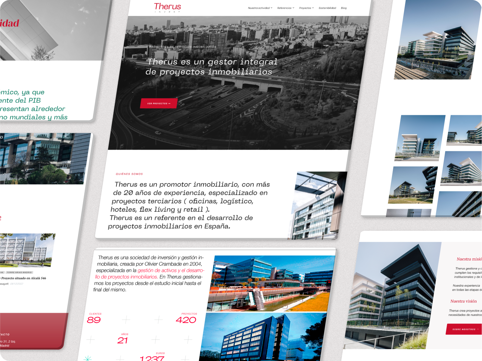
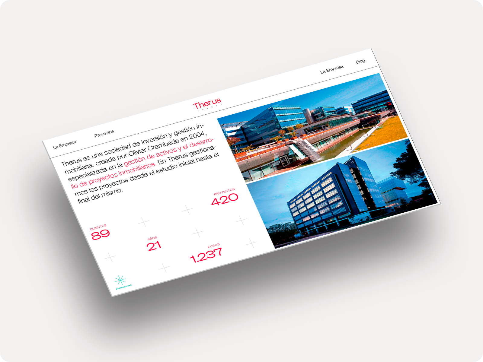
Project OverviewTherus is a real estate investment and asset management company. With a focus on delivering high-quality, sustainable real estate developments, Therus manages every aspect of a project from its initial concept through to completion. The brand is built on core values of transparency, sustainability, and the creation of long-term value for both investors and end-users.
Conceptual Foundation
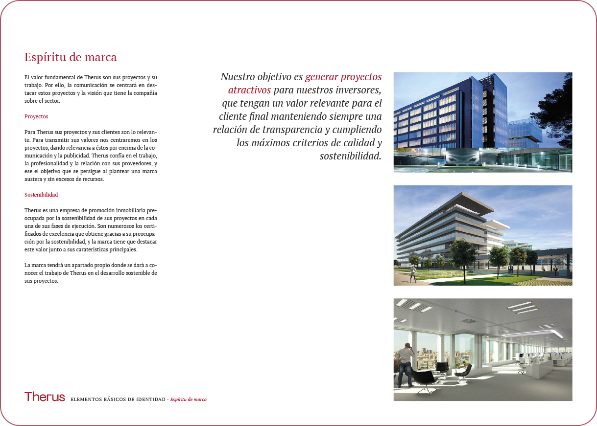
The concept behind Therus’ branding revolves around simplicity and professionalism, with a strong focus on sustainability. The design decisions were guided by the need to create a visual identity that is both clean and timeless. The typographic logo was chosen to maintain a sense of continuity with the company’s history, while modernizing it for greater visual impact. The introduction of green as a secondary color highlights Therus' dedication to sustainable development, ensuring the brand communicates both heritage and innovation.


The brand
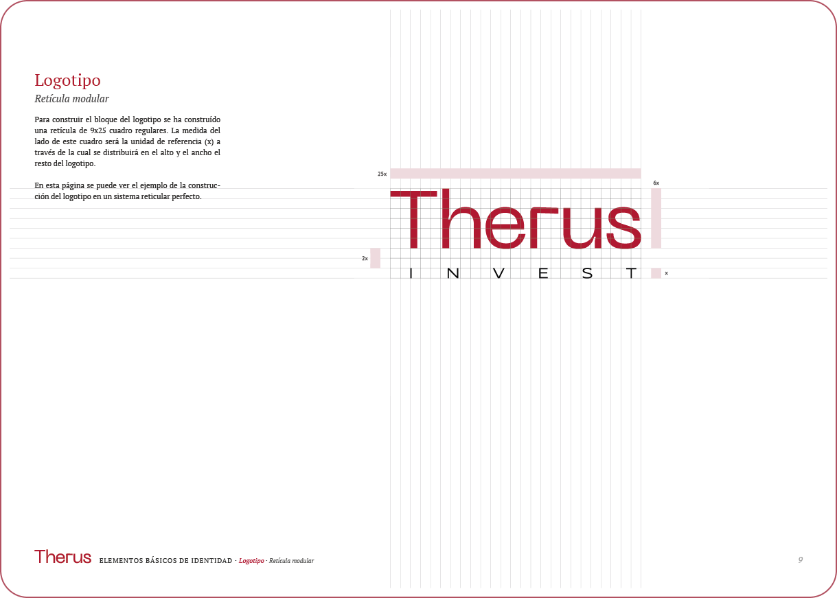
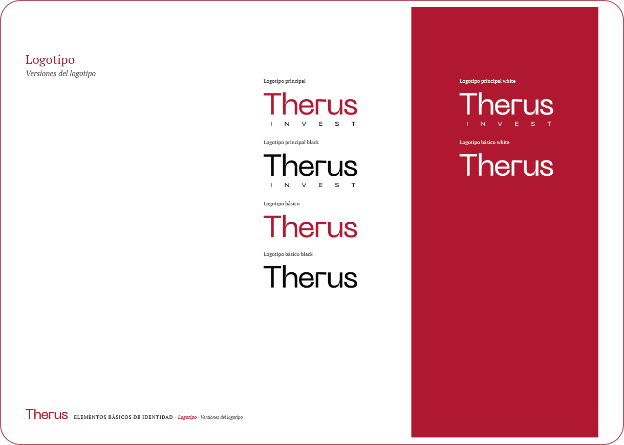
Logo
It is based on a typographic design that uses the Neue Machina font, chosen for its industrial and architectural influences. It conveys strength and precision, which aligns with Therus’ expertise in real estate development. The use of lowercase letters adds a friendly, approachable feel to the brand. To complement this, Syncopate is used in the "invest" portion of the logo, adding contrast and referencing the underlining from the previous logo, modernized for improved legibility.
Graphic Motifs
The visual identity of Therus is built around plurality and synergy, key concepts that define the company's approach. Plurality reflects the diversity of projects, from residential to industrial, while synergy highlights the collaboration between various professionals involved in each development. These values drive Therus’ adaptability and the seamless execution of its projects.
A plus sign (+) was chosen to represent these ideas. It symbolizes collaboration, growth, and the merging of different elements, aligning with the brand’s clean and minimalist aesthetic. This symbol, along with the sustainability mark, reinforces Therus' commitment to teamwork and responsible development.

A key graphic symbol within this identity is the mark created to emphasize sustainability. Sustainability is a core value of Therus, present in every phase of their projects. To highlight this, a unique symbol has been developed, derived from the same linear aesthetic, creating a distinct visual representation of the company’s commitment to environmentally responsible practices. This element reinforces the brand’s dedication to sustainability and distinguishes Therus from its competitors.


Symbol system
Together with the symbol for sustainability, the plurality and synergy symbol forms a crucial part of Therus’ identity, representing the company's guiding principles in every project they undertake.
Graphic Resources
Typography: The corporate typography for Therus is centered around PT Serif, a humanistic serif font that provides clarity and readability across different formats. It reflects the professionalism and timelessness of the brand. As a secondary option, Georgia is used for situations where PT Serif might not be available, ensuring consistency. Both fonts bring a classic yet modern touch to the brand’s communications, emphasizing the company's commitment to quality and precision.
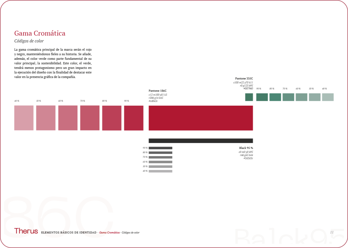
Color Palette: The color palette of Therus is anchored in red and black, preserving the brand's historical roots and symbolizing energy, strength, and stability. A vibrant green has been introduced as a secondary color to emphasize sustainability, a core value of the company. Though used sparingly, the green adds impact and highlights Therus’ commitment to responsible, environmentally friendly development.


Stationery Design
The stationery for Therus reflects the brand’s identity with a clean and sophisticated aesthetic. The letterhead prominently displays the logo alongside essential contact information, utilizing PT Serif for clarity and professionalism.
Business cards adopt a minimalist approach, featuring the Therus logo against a deep red background, while the reverse showcases contact details on a crisp white space. This contrast enhances visibility and embodies the brand's core values, leaving a lasting impression and reinforcing the company's dedication to quality and excellence in every interaction.


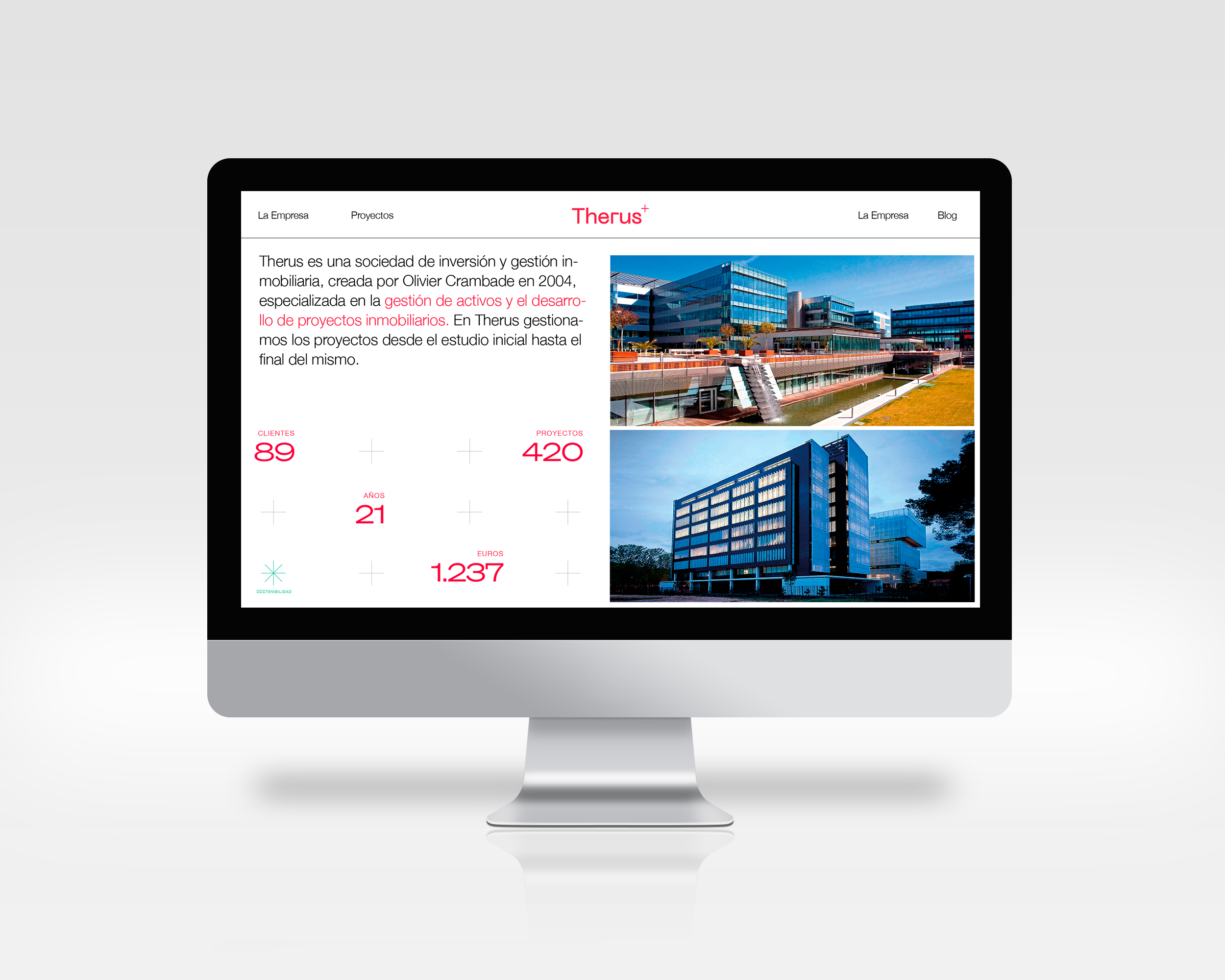
Multimedia Integration
As the designer behind the branding of Therus, my goal was to create a visual identity that encapsulates the company’s commitment to high-quality real estate development and sustainability. The design reflects a clean and modern aesthetic, emphasizing professionalism while showcasing the diverse portfolio of projects, including residential, commercial, and industrial spaces. Each design element is thoughtfully considered to communicate the values of transparency and environmental responsibility, ensuring that every project contributes positively to the community and the environment.
Conclusion
In conclusion, the branding project for Therus represents a harmonious blend of design and core values such as plurality, synergy, and sustainability. By utilizing a minimalist visual language, including a distinctive plus symbol that conveys collaboration and growth, the identity successfully differentiates Therus in a competitive market. The selected color palette and typography not only enhance the brand’s professionalism but also reflect its commitment to quality and environmental consciousness. This cohesive design approach positions Therus as a leader in responsible real estate development, making a lasting impact on both the industry and the communities it serves.
U︎it