eNova UPM
Branding & Identity
Project OverviewThe eNova UPM project revolves around the creation of a cohesive brand identity for an initiative that highlights the technological innovation and entrepreneurial spirit emerging from the Universidad Politécnica de Madrid (UPM). The brand is designed to promote start-ups, technologies, and initiatives within the UPM ecosystem. This identity extends to two core sub-brands: ACTÚA UPM and UPM2T, which are programs aimed at fostering business creation and technological challenges, respectively.
Conceptual Foundation
The eNova UPM brand was conceived with a strong emphasis on technological innovation and entrepreneurship. The name itself, eNova, fuses the letter "e" (symbolizing "emprendimiento," or entrepreneurship) with "Nova" (Latin for "new" or "emerging star"), reflecting the idea of a rising star in the innovation landscape. This combination was chosen to resonate with both Spanish and international audiences, ensuring easy pronunciation and strong brand recognition.
The brand encapsulates the mission to nurture emerging talent from the university, providing a launchpad for technological ventures through entrepreneurial guidance, incubation, and support.


The brand
Naming
The name eNova stems from a careful naming process where several options were considered to reflect UPM’s mission of fostering entrepreneurship without explicitly using the word "innovation." The "e" stands for entrepreneurship, and "Nova" suggests something new and bright, symbolizing the innovative startups and technologies born from UPM.
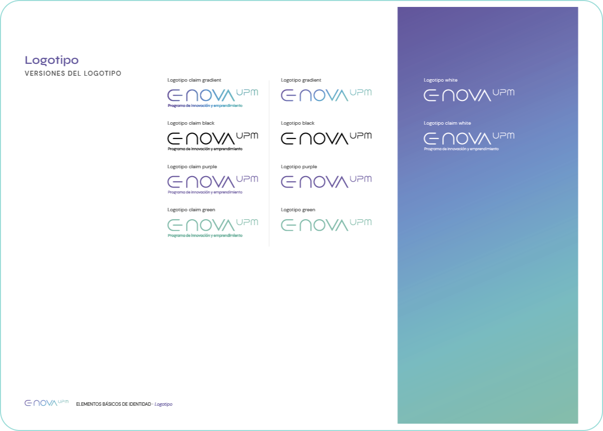
Logo
The eNova logo was crafted to evoke a sense of modernity and technological prowess. The key element of the logo is the oblong bar used to stylize the letter "e," which mimics the on/off switch of technological devices. This design choice reinforces the brand's connection to the digital and tech sectors. The typography used for the logo, Dune Rise by Jesta Designs, is futuristic and distinctive, emphasizing the brand's technological focus. Additionally, the Syne font was chosen for the tagline due to its versatility and clean, modern aesthetic.
Graphic Motifs
The primary graphic motif of the eNova brand is derived from the oval shape of the "e" in the logo. This shape is used as a modular design element throughout the brand’s visual identity. It can be found in patterns, frames, and other design elements to create a unified and recognizable visual language.


This flexibility allows for creative applications of the brand across different media while maintaining visual consistency.


Graphic Resources
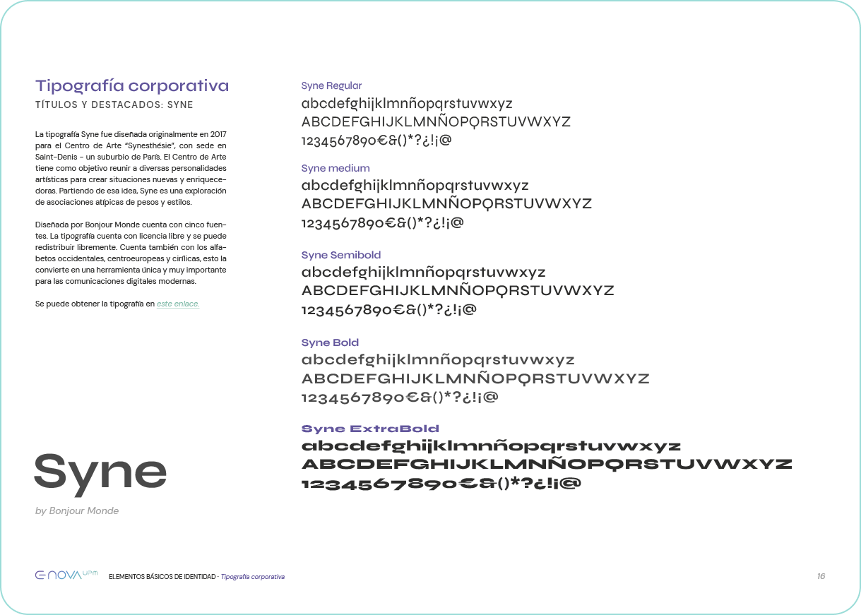
Typography: The brand uses three primary typefaces:
DM Sans for general text, known for its geometric design and adaptability to digital platforms.
Syne for titles and highlights, which brings an avant-garde, modern touch to the brand’s messaging. Helvetica (and its alternative, Arial) is also employed in specific scenarios for its clean, neutral design.
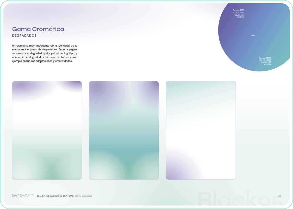
Color Palette: The brand's main colors include a vibrant purple, a fluorescent green and black. These colors create a high-tech, futuristic feel. Gradients, a key component of the brand's visual identity, blend these colors to generate dynamic effects, particularly in the logo. The gradient from purple to green is the most common, aligning with the brand’s innovative and digital spirit.


ACTÚA UPM y UPM2T
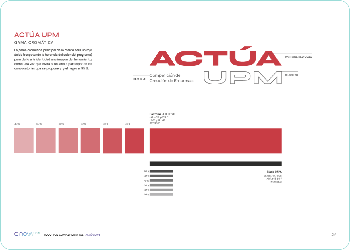
ACTÚA UPM: The ACTÚA UPM brand is focused on a business creation competition. Its logo uses a bold, attention-grabbing typeface, symbolizing a call to action. The main color of this sub-brand is an acid red, complemented by black, which conveys urgency and energy, fitting for a competition.
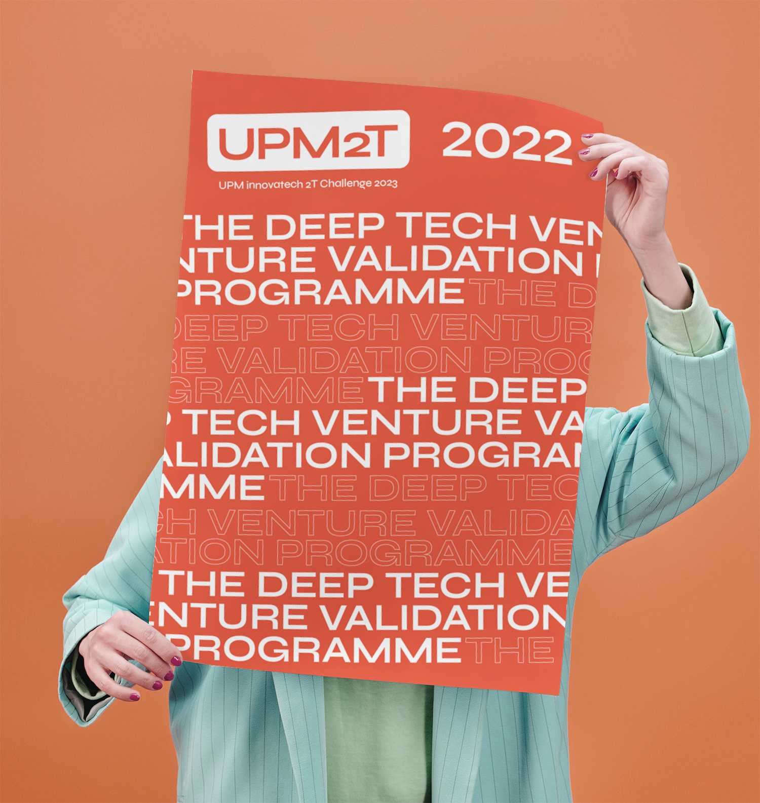
UPM2T: UPM2T is a program designed to challenge students in technology and innovation. Its branding is inspired by modern, poster-like visuals, which can be applied creatively across different formats. The primary color of this sub-brand is an acid orange, which, along with black, creates a contemporary and innovative aesthetic.
ACTÚA UPM: The ACTÚA UPM brand is focused on a business creation competition. Its logo uses a bold, attention-grabbing typeface, symbolizing a call to action. The main color of this sub-brand is an acid red, complemented by black, which conveys urgency and energy, fitting for a competition.
UPM2T: UPM2T is a program designed to challenge students in technology and innovation. Its branding is inspired by modern, poster-like visuals, which can be applied creatively across different formats. The primary color of this sub-brand is an acid orange, which, along with black, creates a contemporary and innovative aesthetic.


Conclusion
The eNova UPM brand represents a bold, innovative step forward in communicating UPM’s role in fostering technological entrepreneurship. With a name that merges the concepts of entrepreneurship and emerging innovation, a logo that signals tech-forward thinking, and a versatile set of graphic motifs, the brand establishes a solid visual identity.
The sub-brands, ACTÚA UPM and UPM2T, fit seamlessly within this ecosystem, each with a distinct yet complementary identity that supports UPM’s mission to lead in digital transformation and innovation.
U︎it