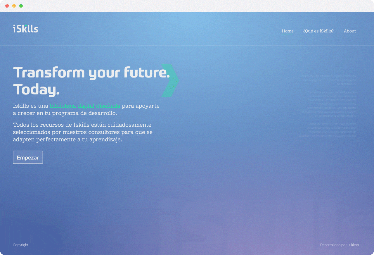
iSkills
Digital Platform
Client
iSkills is a digital platform developed for the outplacement and skills development divisions of Lukkap HR, a global leader in business management and human resources consultancy.
Project Overview
Lukkap HR required a digital repository that could effectively organize and classify content aimed at enhancing the skills of consultants' students. The goal was to create a robust and comprehensive tool that would enable consultants to access and curate resources easily, ultimately providing better learning and development opportunities for users undergoing career transitions.
Challenge
The main challenge was to design an intuitive and scalable platform capable of hosting a vast amount of content while offering a seamless user experience. This required deep user research, a clear information architecture, and a design system that could evolve with the platform’s growth.
My role
Conceptualization & Product Definition, User Research & Flow Chart Developmen, Prototyping & Interaction Desig, Visual Design & UI, Design System Creatio, Management of the Content Team.
PROCESS
The first step in this project was an extensive research phase.I conducted interviews and surveys with Lukkap's consultants and their students to gain insights into their needs, pain points, and how they currently interacted with content. I also gathered data on their preferred digital tools, expectations, and workflows. This research helped us identify key problems, such as:
Based on the research, we created personas and user journeys to better understand the different types of users—consultants, students, and HR managers—ensuring that the platform would be tailored to each audience.
The goal was to create a robust and comprehensive tool that would enable consultants to access and curate
User Research
The first step in this project was an extensive research phase.I conducted interviews and surveys with Lukkap's consultants and their students to gain insights into their needs, pain points, and how they currently interacted with content. I also gathered data on their preferred digital tools, expectations, and workflows. This research helped us identify key problems, such as:
- Difficulties in accessing relevant content quickly.
- A lack of personalized learning paths.
- Disorganized resource libraries leading to inefficient time management.
Based on the research, we created personas and user journeys to better understand the different types of users—consultants, students, and HR managers—ensuring that the platform would be tailored to each audience.
The goal was to create a robust and comprehensive tool that would enable consultants to access and curate
resources easily.


Branding
To give iSkills its unique digital presence, we developed a brand strategy that emphasized clarity, professionalism, and growth. We chose a modern color palette and typography that felt both approachable and trustworthy. The branding was incorporated into all design elements to ensure a consistent experience across the platform.
Typography
The sans-serif font chosen (Prometo Sans family) for iSkills balances professionalism with approachability, reflecting Lukkap’s dual role as a traditional HR consultancy and modern digital provider. Its clean, geometric style ensures clarity and readability while adding a human touch, ideal for a platform focused on personal development.
Color Palette
The color scheme—blue for trust and technology, and green for growth—creates a modern, approachable interface. The gradient backgrounds enhance this, giving the platform a sleek, professional look that aligns with Lukkap’s brand while emphasizing innovation and progress.
UI Elements
Key branding elements like arrows and iconography emphasize forward movement, guiding users toward growth. The clean, structured layout ensures an intuitive experience, while personalized greetings and clear competency paths engage users, reflecting Lukkap’s focus on personal and professional advancement.

UX/UI Design
The user experience design focused on simplifying navigation and ensuring the information was easy to find and engage with. The process involved:
Information Architecture
We created an intuitive IA that organized content into relevant categories, making it easier for consultants to find materials. This structured approach also allowed for seamless scalability as new resources were added over time.
Wireframes & Prototypes
After defining the user flows, I created low-fidelity wireframes to visualize how users would interact with the platform. These were later transformed into high-fidelity prototypes, which were tested with a select group of users. Feedback from these sessions was crucial in refining the interaction design.
Interaction Design
Every click, hover, and scroll was thoughtfully designed to create a smooth and engaging user experience. Particular attention was paid to key functions like content search, bookmarking, and the creation of personalized learning paths.
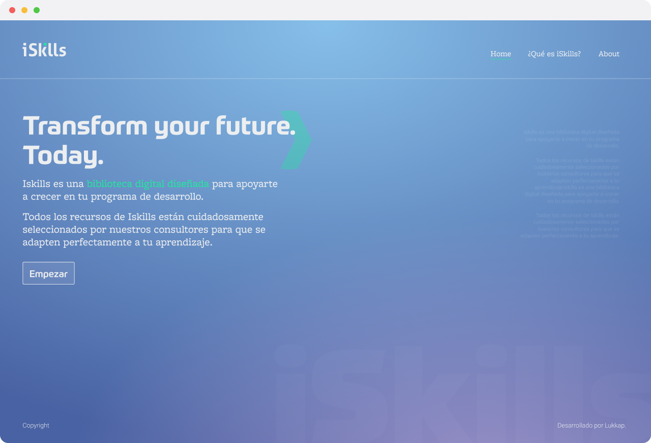
Visual Design & UI
The interface was designed to be visually clean and easy to navigate. We focused on minimizing distractions while providing a clear hierarchy of information. Icons, typography, and color choices were carefully selected to align with both the brand and usability principles.
The interface was designed to be visually clean and easy to navigate. We focused on minimizing distractions while providing a clear hierarchy of information.
Wireframes & Prototypes
After defining the user flows, I created low-fidelity wireframes to visualize how users would interact with the platform. These were later transformed into high-fidelity prototypes, which were tested with a select group of users. Feedback from these sessions was crucial in refining the interaction design.
Interaction Design
Every click, hover, and scroll was thoughtfully designed to create a smooth and engaging user experience. Particular attention was paid to key functions like content search, bookmarking, and the creation of personalized learning paths.
Visual Design & UI
The interface was designed to be visually clean and easy to navigate. We focused on minimizing distractions while providing a clear hierarchy of information. Icons, typography, and color choices were carefully selected to align with both the brand and usability principles.


U︎it