Migration Organizational Model
Identity & Editorial Design
Client
Migration is a consultancy specializing in digitalization and digital transformation. The project involved a complete overhaul of their corporate identity and the creation of printed brochures that clearly communicate their MOM methodology. This methodology reflects Migration's values of innovation, advanced technology, and a focus on providing digital solutions for businesses.
My role in the project:
Brand Design, Brand Strategy, Editorial Design, Illustrator, Visual Design.
-
As part of Migration’s branding initiative, a series of printed brochures were developed to clearly explain the company’s methodology. These materials were designed to ensure a seamless integration with the newly redesigned brand identity, serving as a tangible extension of the company's innovative ethos.
Explore the branding and web project

Design Concept
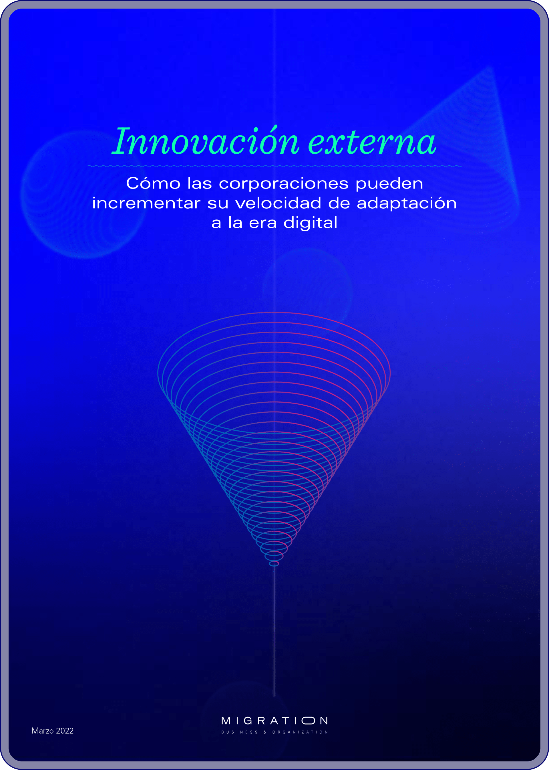
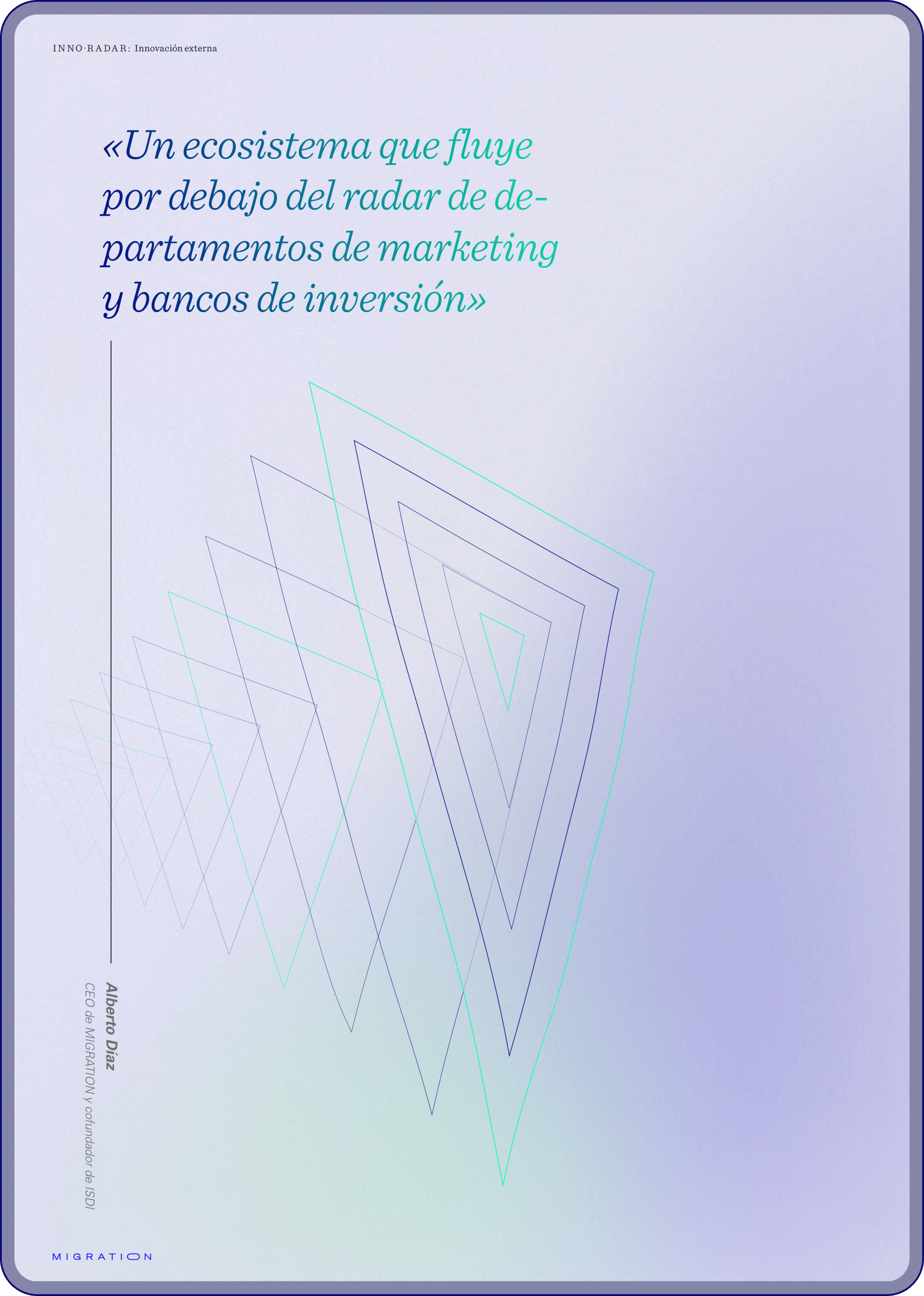
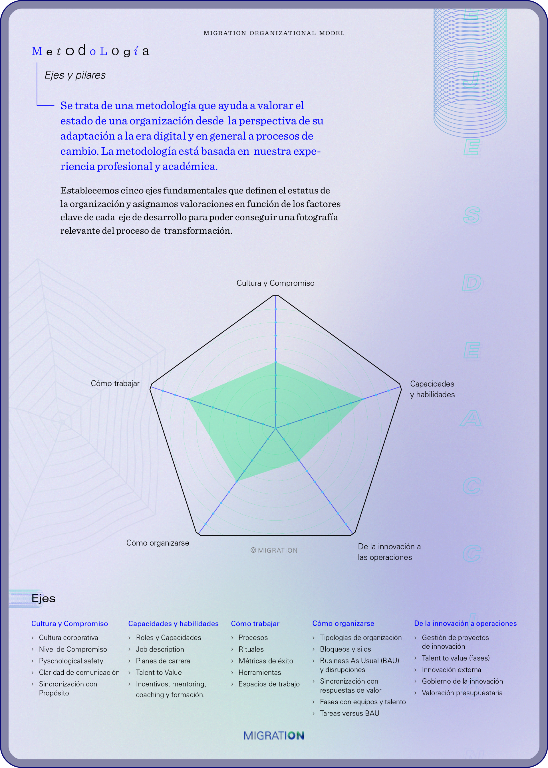
The brochure design was driven by the need to communicate the Migration methodology in a clear, visually engaging way. An abstract geometric visual universe was developed to reflect the precision and innovation inherent to the methodology, offering a modern and minimalist aesthetic. This design approach allowed the content to stand out while maintaining a sense of sophistication and clarity.

Typography and Color Palette
The brochures employed the same typography as the new visual identity, balancing digital modernity with humanistic warmth. Two fonts were selected: one that conveyed a clean, technical look and another that introduced a more personal touch. This combination ensured clarity and reinforced Migration's message of blending technology with human insight.
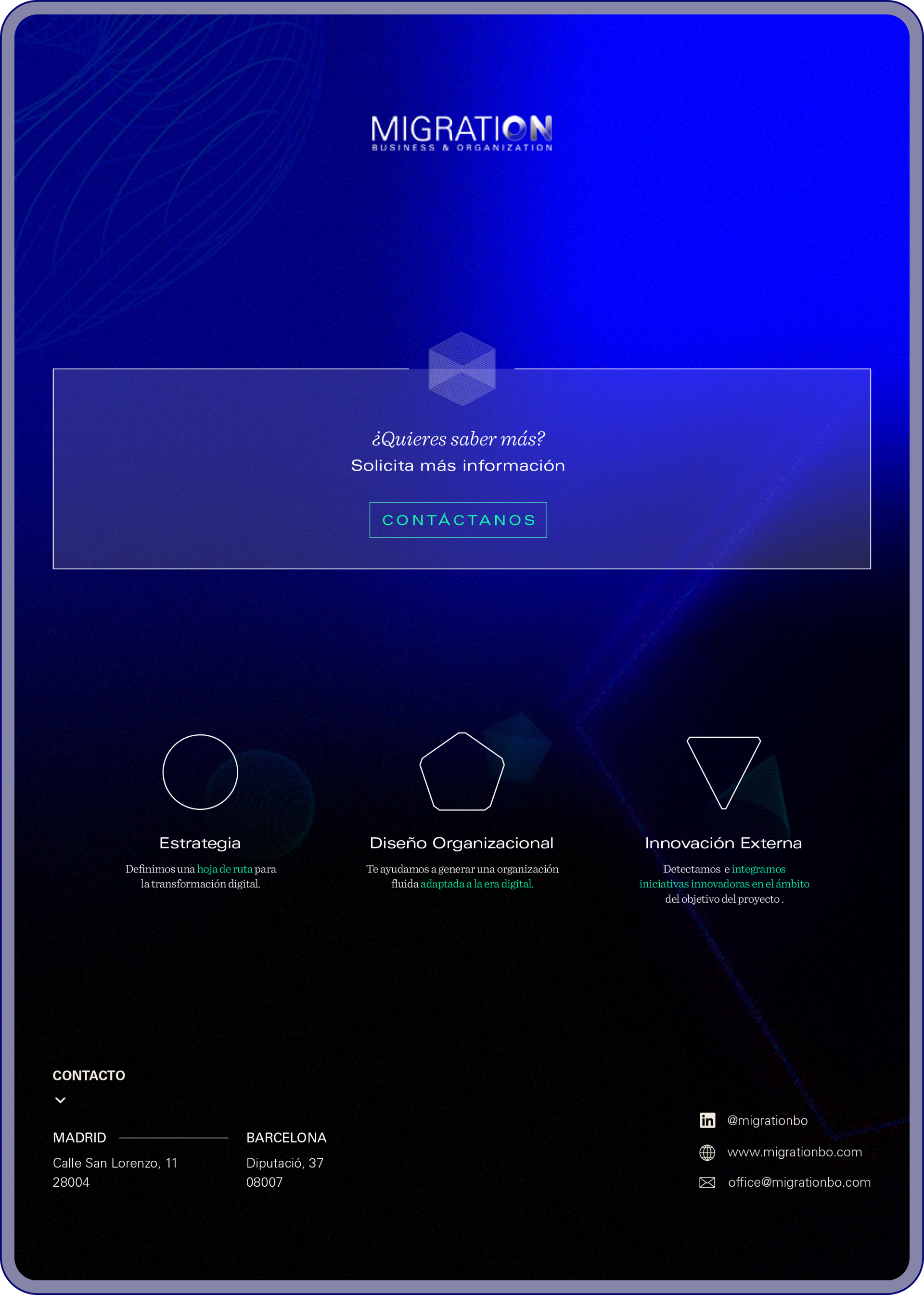
The color palette, dominated by vibrant electric blue on dark backgrounds, aligned with Migration’s representation of innovation and technological prowess. The high contrast between colors and the minimalist design approach made the brochures highly readable while still visually dynamic.

This geometric language not only enhanced the visual system but also allowed for an intuitive structure that communicated complex information in a simplified and coherent manner.


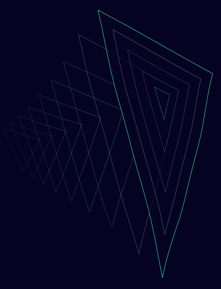
Use of Geometry and 3D Imagery
In keeping with the brand’s geometric foundation, the brochures featured three-dimensional representations of the key shapes, adding depth to the design and emphasizing Migration's commitment to precision. These figures provided a sense of movement and transformation, echoing the company's promise of guiding clients through complex technological processes with clarity and expertise.
![]()
Final Impact
The brochures not only effectively communicated Migration's methodology but also reinforced the company’s refined, tech-forward brand identity. By utilizing a cohesive visual system, the materials elevated the client experience, making complex information accessible while maintaining a strong connection to Migration's corporate narrative and core values.
![]()
The brochures not only effectively communicated Migration's methodology but also reinforced the company’s refined, tech-forward brand identity. By utilizing a cohesive visual system, the materials elevated the client experience, making complex information accessible while maintaining a strong connection to Migration's corporate narrative and core values.