Migration
Web Design
Client
Migration is a consultancy specializing in digitalization and digital transformation. The project involved a complete renewal of their corporate identity and the creation of a website that reflected their values of innovation, advanced technology, and focus on digital solutions for businesses.
My role in the project:
Brand Design, Brand Strategy, Prototyping, User Experience Design (UX), Interaction Design, Visual Design.
PROCESS
Phase 1: Strategy
The process began with an in-depth analysis of Migration's values, services, and vision. As a digital transformation consultancy, the site needed to communicate their ability to handle complex digitalization processes. Market and competitor research was conducted to identify expectations within the digital consulting sector, as well as relevant visual and functional trends.
Key Objectives:
1 | Position Migration as a leader in the digital consulting sector.
1 | Position Migration as a leader in the digital consulting sector.
2 | Align their brand image with their focus on advanced technological solutions.
3 | Simplify communication of their core services to enhance clarity and accessibility.

Phase 2: Brand Redesign
The redesign of the logo and visual identity was a fundamental part of the project. A new logo was created to represent the company's technological focus, using clean and abstract geometric shapes that evoke transformation and precision.
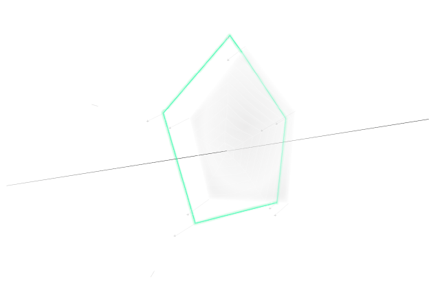
To improve the communication of the company’s services, three main geometric figures were incorporated: the circle, triangle, and hexagon, each representing a key service. These figures not only simplify site navigation but also create a coherent visual system that reinforces the corporate narrative and facilitates understanding of the services.
Typography and Visual Universe:
The typography was carefully selected after an in-depth research process. Two complementary typefaces were chosen to convey both simplicity and a connection to the digital world, while also reflecting the humanistic character of the consultancy. The combination of these fonts not only enhanced the readability but also reinforced the brand's message. The color palette, dominated by electric blue on dark backgrounds, signifies innovation, while subtle animations and visual effects introduce dynamism, enriching the user experience and highlighting the company's core values.
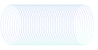
Interdimensional geometry
The design of the website showcases a distinct visual identity rooted in geometric abstraction, with figures that stand out due to their bold simplicity and structured arrangement. These shapes, characterized by sharp lines, clear edges, and contrasting angles, evoke a sense of modern minimalism. The use of dark tones, combined with geometric forms like rectangles, triangles, and circles, creates a visually compelling universe that feels both organized and dynamic. This calculated design approach reinforces the brand’s identity by emphasizing clarity, balance, and a progressive aesthetic, making the brand’s visual communication cohesive and immediately recognizable.
The typography was carefully selected after an in-depth research process. Two complementary typefaces were chosen to convey both simplicity and a connection to the digital world, while also reflecting the humanistic character of the consultancy. The combination of these fonts not only enhanced the readability but also reinforced the brand's message. The color palette, dominated by electric blue on dark backgrounds, signifies innovation, while subtle animations and visual effects introduce dynamism, enriching the user experience and highlighting the company's core values.
The design of the website showcases a distinct visual identity rooted in geometric abstraction, whose shapes, characterized by sharp lines, clear edges, and contrasting angles, evoke a sense of modern minimalism.
Interdimensional geometry
The design of the website showcases a distinct visual identity rooted in geometric abstraction, with figures that stand out due to their bold simplicity and structured arrangement. These shapes, characterized by sharp lines, clear edges, and contrasting angles, evoke a sense of modern minimalism. The use of dark tones, combined with geometric forms like rectangles, triangles, and circles, creates a visually compelling universe that feels both organized and dynamic. This calculated design approach reinforces the brand’s identity by emphasizing clarity, balance, and a progressive aesthetic, making the brand’s visual communication cohesive and immediately recognizable.
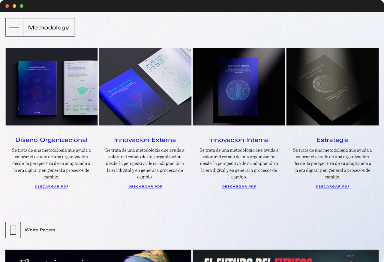
These dossiers utilize geometric design elements to reflect the brand's identity, combining sharp shapes and balanced layouts to communicate clarity and innovation.


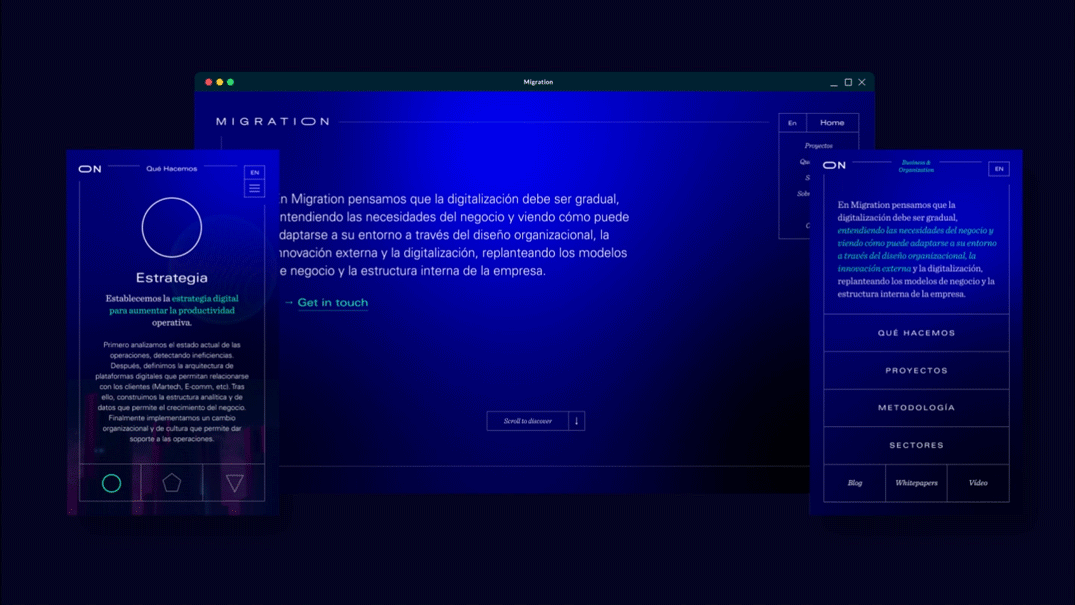
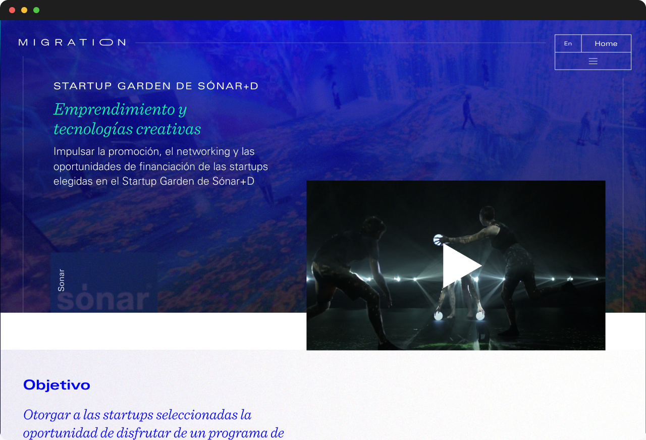
Phase 3: UX/UI Design of the Website
The user experience (UX) design focused on making key information easily accessible without compromising the digital aesthetic. Each section was designed to intuitively guide the user, with smooth transitions and a clear content hierarchy.
Both the desktop and mobile versions of the website were designed specifically for each device rather than relying on simple responsive adaptation. The desktop version utilizes space to present visually attractive content, while the mobile design prioritizes accessibility and ease of use, optimizing touch interactions and fluid navigation.
DESKTOP & MOBILE
Desktop: Through interactive graphic elements and animated geometric shapes, users can clearly visualize each of Migration’s services. Transitions between sections add a sense of depth, making the navigation experience immersive.
Desktop: Through interactive graphic elements and animated geometric shapes, users can clearly visualize each of Migration’s services. Transitions between sections add a sense of depth, making the navigation experience immersive.
Mobile: The mobile design is not just a responsive adaptation, but a custom experience created specifically for mobile devices, ensuring easy navigation and well-structured content. It reduces scrolling for long texts and avoids visual overload for users.


Results
The final result was a website that not only reflected Migration’s identity but also significantly improved the clarity of how its services were communicated. The implementation of geometric figures allowed for a clear distinction between the company's different areas, while the use of a visually appealing and modern design reinforced its positioning in the digital consulting sector.
The website design helped Migration consolidate its image as an innovative company, delivering an immersive user experience that communicates professionalism and sophistication.
The website design helped Migration consolidate its image as an innovative company, delivering an immersive user experience that communicates professionalism and sophistication.
U︎it